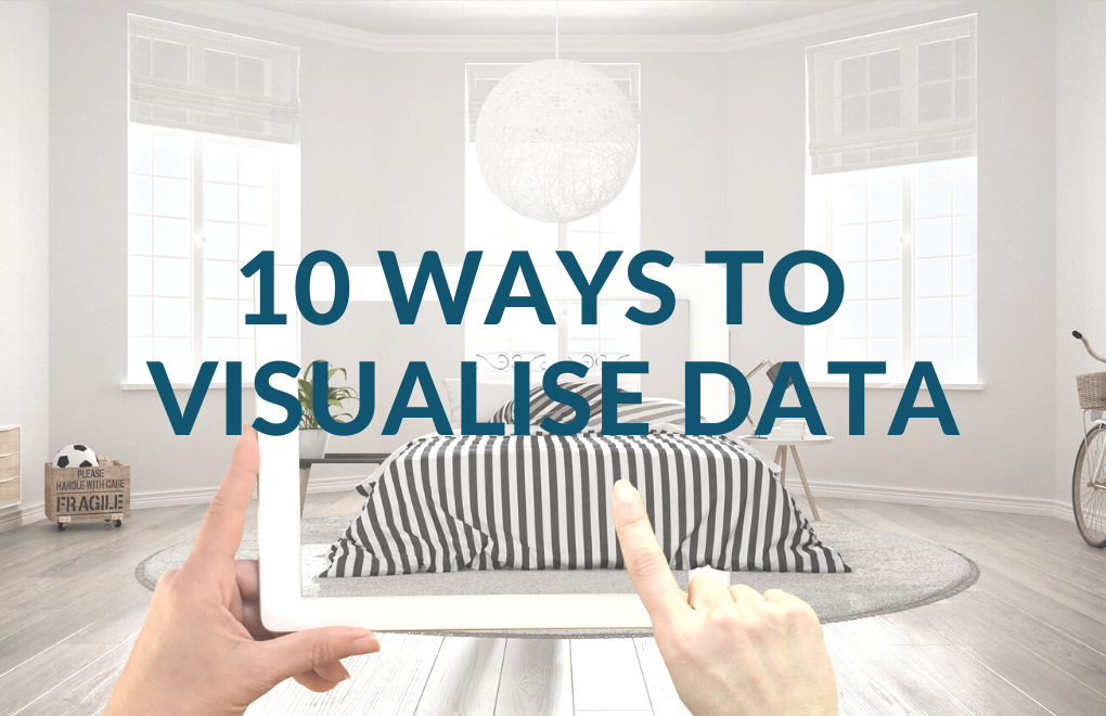
From explainer videos to augmented reality, data visualisation can get your message across to your dream audience swiftly. Check out these ten innovative ways to visualise your message!
Data is powerful.
It helps companies make educated decisions, guide both internal and external stakeholders’ opinions and actions, and convince and win over clients and supporters faster and more reliably than any written content.
But, data can also be boring, dry and turn consumers away faster than any written content.
Here are ten innovative ideas to visualise data in a way that speaks both to the reason and the emotion of consumers.
Which one will your team try out next?
1 – Explainer Video
Explainer videos are a shortcut to introducing new concepts, explaining key topics in your industry or showcasing how your company works.
This example from XPLAI, a company crafting such videos ticks off all the boxes: it is value-adding, informative, concise, and seamlessly tied into the client’s journey.
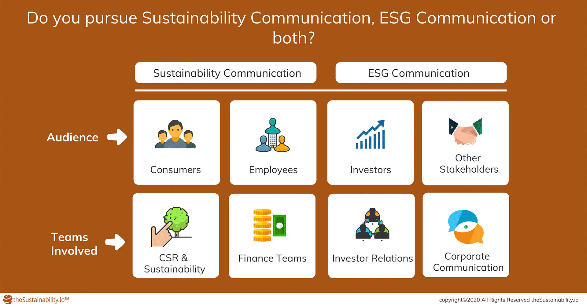
2 – Informative GIF
GIFs are not only for memes made to crack your colleagues up in the middle of a tedious workday. When done right, they can be informative, as in this GIF infographic that explains the differences and overlaps between ESG communication and sustainability communication.
A similar approach could be applied to explain different service packages and their benefits for clients.
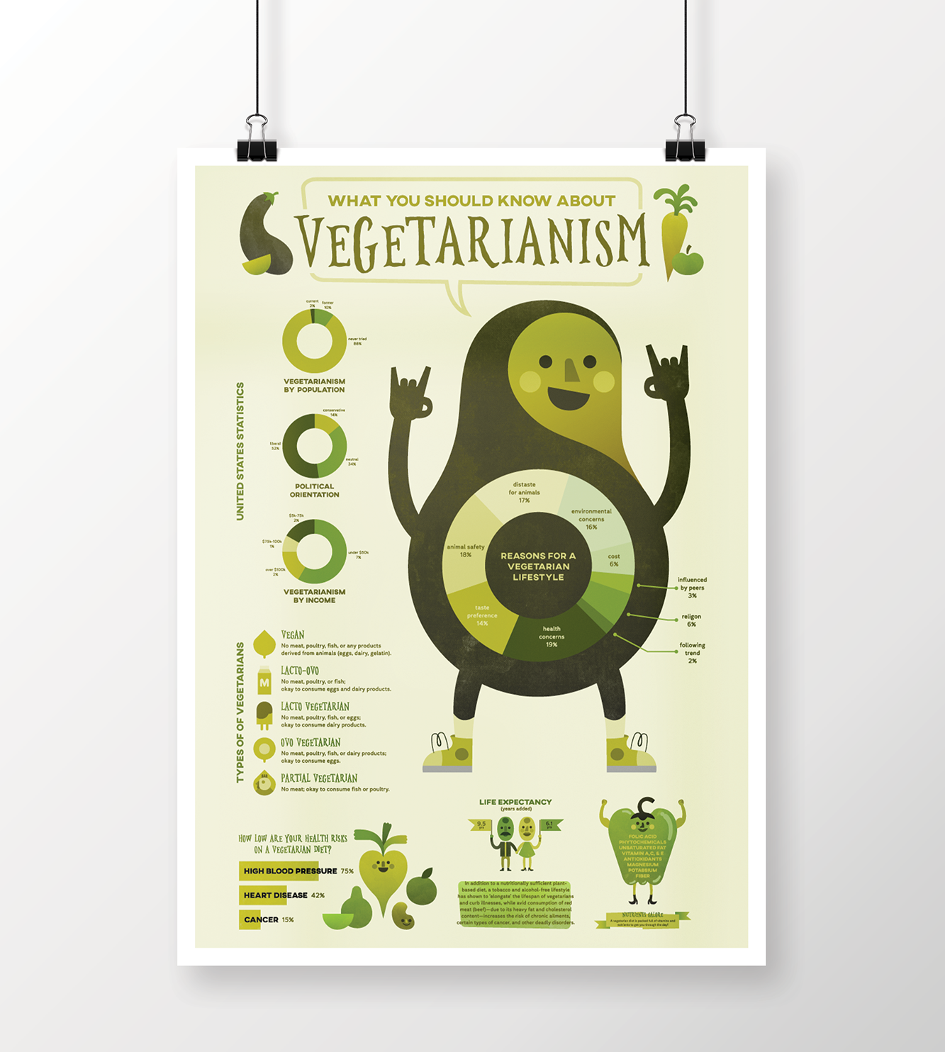
3 – Infographic
Infographics are the way to go when there is a lot of data to be presented in a tight space.
In this example, Amber Zuñiga shared perspectives on vegetarianism in a way that would have required a few thousand characters to explain in writing.
Time-consuming to create? Maybe, but also evergreen content that can easily go viral.
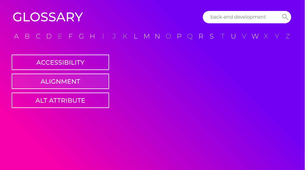
4 – Glossary
A glossary is another way to condense a lot of information in a limited space, as the format eliminates the need for lengthy explanations and transitions. The risk? Being dry, overly factual and having everyone skip the whole thing…
Unless you put your glossary into a visual and interactive format, like Allison Goldthorpe has done in her glossary of Web-design Terminology for Non-Designers. Alphabetisation and search functions make the glossary easy to use, and the ease attracts users to find out more.
5 – Interactive Dashboard
Interactivity is also at the heart of the attraction of interactive dashboards. In this kind of visual data, readers can find out more by hovering over certain parts of the tableau, or for example, choosing a time period or the location of the information they are looking for.
Interactive dashboards also find many applications in internal communications, where they can be used to communicate the outcomes and progress of a project and the results achieved.
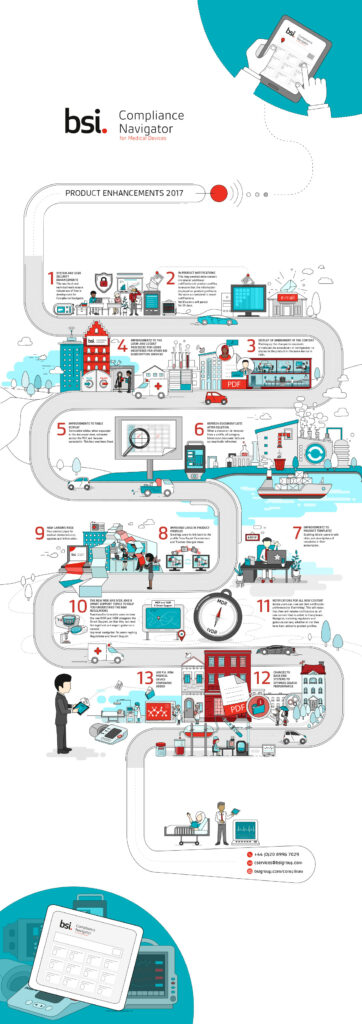
6 – Map
A map is a subtype of an infographic, which lends itself particularly well to laying out processes, such as client journeys or methodology.
In this infographic created for BSI (Product Enhancements), the designer Julia Zhukova takes her viewers – quite literally – on a trip through the twists and turns of the compliance journey for medical devices.
7 – Case Study
A business case study doesn’t sound like the most innovative content format… until you decide to approach it creatively!
Case studies can be turned into concise and visually appealing pieces of content, as long as you remember to keep them short, be selective with the information and be careful with the representation. Venngage offers a selection of great examples as well as customisable templates to do just that.
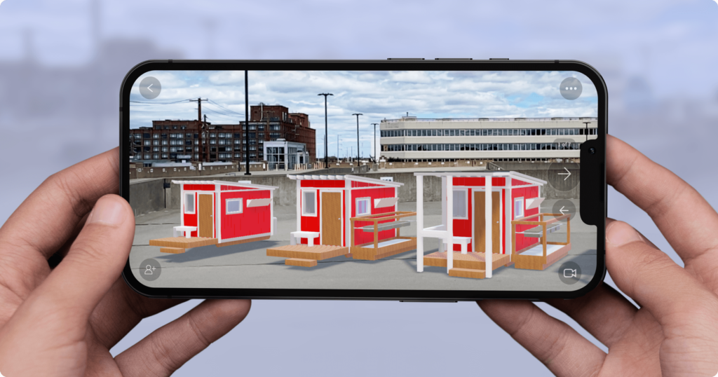
8 – Augmented Reality Visualisation
Augmented reality (AR) visualisations have found their place, for example, in the furniture and interior decoration business, where service providers can showcase how perfectly a certain tile would work in your future bathroom. But Hope Factory Production, a collective of architects, engineers, planners, and industrial designers used it in quite an ingenious way to illustrate their project called Tiny Houses and its goal to reduce homelessness. Thanks to AR visualisation, they found a way to illustrate the ease and usefulness of Tiny Homes to bring different stakeholders on board.
9 – Virtual Reality Experience
Let’s go one step further and leverage virtual reality in data visualisation. How better to showcase the rise and fall of stock exchanges, for example, than letting inquisitive minds experience the highs and lows themselves, as in this Wall Street Journal VR data representation project which follows Nasdaq’s ups and downs?
10 – Visual storytelling
Finally, storytelling is not the exclusive domain of writers.
The pharma company GSK combines visual storytelling using video format and augmented reality in their project, where an AR helmet allows people to experience the migraines of their loved ones. At last, leveraging the concepts of storytelling in a visual context.
This campaign takes the saying “Show, don’t tell” to a whole other level.


Recent Comments